Key Elements of an Accessible Website
Madison Mohn • 15 January 2025
Make Your Website Accessible for All!
Creating an accessible website isn’t just about following guidelines—it’s about making the web inclusive for everyone, regardless of their abilities. Accessibility ensures that all users, including those with disabilities, can easily navigate, understand, and interact with your website. From adjusting color contrast to using accessibility plugins, every step contributes to a better user experience.
This guide will explain the essential elements of accessible design, including tips, tools, and the benefits of prioritizing accessibility. Whether you’re new to accessibility or looking to improve your site further, these principles will help you build a web that’s welcoming and usable for all.

Color Contrast
Color contrast ensures that text is readable against its background. For example, light gray text on a white background can be difficult for people with visual impairments to read. Aim for a contrast ratio of at least 4.5:1 between text and its background, as recommended by the Web Content Accessibility Guidelines (WCAG).
Color isn’t just about contrast—it’s also about making sure colors aren’t the only way to convey information. For example, if a form error is shown in red text, add an icon or a message to explain the issue so colorblind users can still understand.
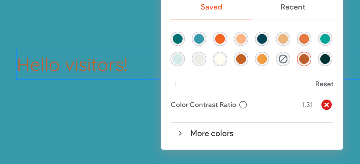
Color Contrast Tools: A Must for Accessible Design
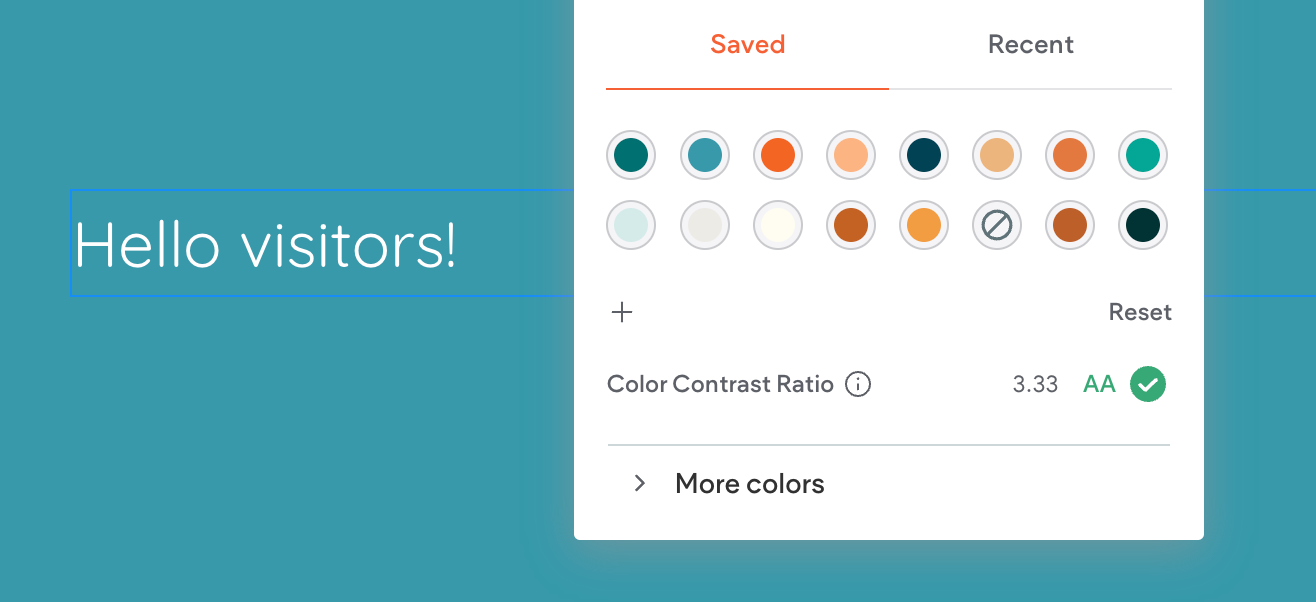
When designing for accessibility, using tools to measure color contrast can save you time and ensure compliance. One popular tool is a Color Contrast Checker, which evaluates the contrast ratio between text and background colors. These tools tell you whether your design meets accessibility standards (WCAG 2.0 or 2.1) and grades it at levels like AA or AAA.
For example, the contrast ratio in the image above is 12.76, earning a AAA rating—the highest level of compliance. This means the text is very readable, even for users with visual impairments.
Some great color contrast checkers include:
- WebAIM Contrast Checker: Simple and user-friendly.
- Contrast Grid: Useful for testing multiple color combinations.
- Accessible Colors Tool: A quick way to tweak colors for better contrast.
Using these tools, you can ensure that your site’s color scheme works for everyone. It's an easy step that makes a big difference!
Font Sizes and Styles
Readable fonts are essential for all users:
- Use fonts like Arial, Verdana, or other sans-serif fonts.
- Keep font sizes at least 16px for body text.
- Avoid overly decorative fonts for important content.
- Line spacing and proper letter spacing can also improve readability.
Accessibility Plugins
Accessibility plugins make it easier to comply with standards. These tools allow users to:
- Adjust contrast or font size.
- Enable screen readers.
- Navigate the site using only a keyboard.
Popular plugins include
UserWay,
WP Accessibility Helper, and
EqualWeb. Many of these tools also alert designers to accessibility issues as they arise.
Image Tags (Alt Text)
The alt text describes what’s in an image so that screen readers can explain it to visually impaired users. For example:
- Instead of “image1.jpg,” write something like “A young woman using a laptop on a sunny balcony.”
- Keep descriptions short but meaningful.
Keyboard Navigation
Not everyone can use a mouse. Ensure your website is fully navigable with a keyboard. Focus indicators (e.g., a visible outline on buttons or links) help users understand where they are on the page.
Video and Audio Accessibility
For multimedia content:
- Add captions to videos for those who are deaf or hard of hearing.
- Provide transcripts for audio files.
- Avoid autoplay, as it can overwhelm users with sensory processing issues.
Benefits of Accessible Websites
- Wider Audience: About 15% of the world’s population lives with a disability. That’s a lot of potential visitors you don’t want to leave out.
- Better SEO: Search engines favor sites with alt text, proper headings, and structured content, which are all part of accessibility.
- Legal Compliance: Many countries have laws requiring accessibility, like the Americans with Disabilities Act (ADA) in the U.S.
Improved Usability for All: Features like clean design, clear navigation, and readable fonts benefit everyone, not just users with disabilities.

Create an Inclusive Web: Prioritize Accessibility for All Users!
Designing for accessibility makes the web a better place for everyone. From color contrasts to accessibility plugins, each step brings you closer to an inclusive site that works for all users. By making accessibility a priority, you’re not just following best practices—you’re showing that you care about your audience and their needs.
Let’s build a web that’s welcoming to all!
Reach out to us today if you need expert guidance or support in creating an accessible website. Together, we can make your site inclusive and impactful for every visitor.