
The Power of Mapping Your Navigation Bar Content for Your Small Business Website
Madison Mohn • 3 January 2024
As a small business owner, one of the most crucial aspects of your online presence is your website. When designing a website, it is easy to get caught up on the aesthetics and design. However, one of the most important elements that can impact user experience is how easy it is for your visitors to navigate your website.
This is where having well-designed navigation bar content can significantly improve the overall user experience. In this blog post, we will explore the power of mapping your navigation bar content for your small business website.
What is a Navigation Bar?
A navigation bar is a set of links or buttons that are typically located at the top of a website. The primary function of a navigation bar is to provide users with a quick and easy way to move around your website. It typically includes links to various pages on your website, such as the homepage, about us page, products/services page, and contact page.
Benefits of Mapping Your Navigation Bar Content
Mapping your navigation bar content means creating a visual plan of the links that will be placed in your navigation bar. This process is beneficial for several reasons. Firstly, it ensures that all of your necessary pages are included in the navigation bar. Secondly, it allows you to organize your content in a way that makes sense to your users. Lastly, it enables you to prioritize your content based on its importance.
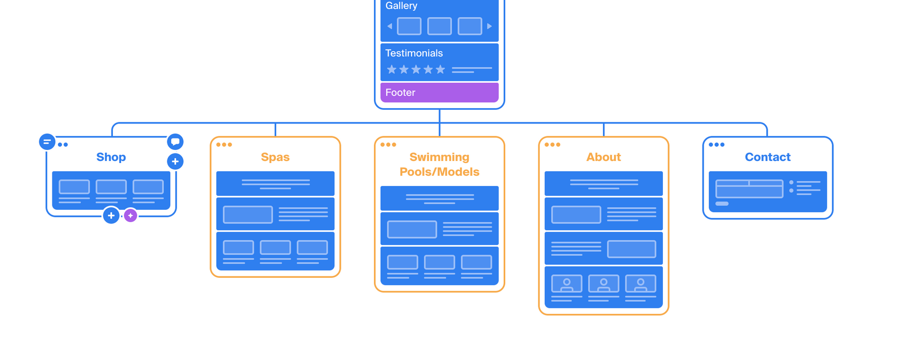
Tips for Mapping Your Navigation Bar Content
When mapping out your navigation bar content, it is essential to consider your users' needs and preferences. Start by identifying your primary and secondary pages. Your primary pages are those that your users are most likely to click on, such as the homepage, products/services page, and contact page. Secondary pages are those that are less frequently visited, such as your blog page or FAQ page.
1. Keep It Simple and Intuitive
A cluttered and confusing navigation bar can frustrate visitors and ultimately lead them to abandon your website entirely. That's why it's crucial to prioritize ease of use when deciding how to organize your pages and links. Stick to a clear and logical hierarchy, starting with broad categories and then breaking down into more specific sub-sections.
2. Remember Mobile Phone Sizing
We've all been there - trying to navigate a website on our mobile phones only to find ourselves frustrated with tiny buttons and never-ending menus. That's why it's crucial to consider mobile phone sizing when designing your website's navigation bar. With phone screens being significantly smaller than desktops, it's essential to prioritize what you want visitors to do. By putting the most critical buttons at the top of the mobile navigation, you can ensure that your visitors can easily find what they need without getting lost in the abyss of menus.
3. Make Sure Navigation Bar Items are Clearly Labeled
One of the best ways to create a user-friendly website is by ensuring that your navigation bar is designed with clear and concise labeling. This means using everyday language that the average visitor can easily understand. Avoiding jargon or complicated terminology minimizes confusion and ensures that users can easily find the information they are looking for.
4. Do you need a call to action?
One way to ensure you're guiding visitors in the right direction is by implementing a main call to action button on the top right-hand corner of your navigation bar. This eye-catching button, usually in a poppy color, offers visitors the next step to engage with your brand - whether it's making a call, sending an email, or placing an order. By making this process as simple and effortless as possible, you not only increase the chances of converting visitors into customers, but also create a memorable and positive interaction with your brand.
Best Practices for Navigation Bar Design
In addition to mapping out your navigation bar content, it is essential to consider the design of your navigation bar. The navigation bar should be easily visible and accessible from any page on your website. It is also essential to consider the placement and order of your navigation bar links. Your most important pages should be located on the left-hand side of the navigation bar, and less important pages on the right-hand side.
Group Similar Content Together
A navigation bar should be intuitive to use. One way to achieve this is by grouping similar content together. For example, if your website has several pages about different aspects of gardening, group them together under a "Gardening" tab in the navigation bar. This way, users can easily find related pages without having to search extensively. By grouping similar content together in the navigation bar, you can make your website more user-friendly and improve the overall user experience.
Utilize Dropdown Menus if Needed
One method that can greatly improve user experience is the use of dropdown menus. These menus allow for a clear and organized display of sub-pages or categories, making it easier for visitors to find and access the information they are looking for. With a well-designed dropdown menu, users can quickly and easily navigate through your website's content without feeling overwhelmed or lost.
Testing and Updating Your Navigation Bar
Once you have designed and mapped out your navigation bar content, it is crucial to test it. Ask friends, family, and colleagues to navigate your website and provide feedback on the ease of use and navigation. Based on this feedback, you can make changes and updates to your navigation bar to improve the user experience continually.
Unlock Your Digital Marketing Potential
Your navigation bar plays a crucial role in the overall user experience of your website. By mapping out your navigation bar content, you can ensure that your users can find the information they need quickly and easily. It is essential to organize your navigation bar content based on your users' preferences and needs, prioritize your content based on its importance, and consider best practices for navigation bar design. By testing and updating your navigation bar regularly, you can continually improve your website's user experience and ultimately drive more traffic and conversions to your small business.
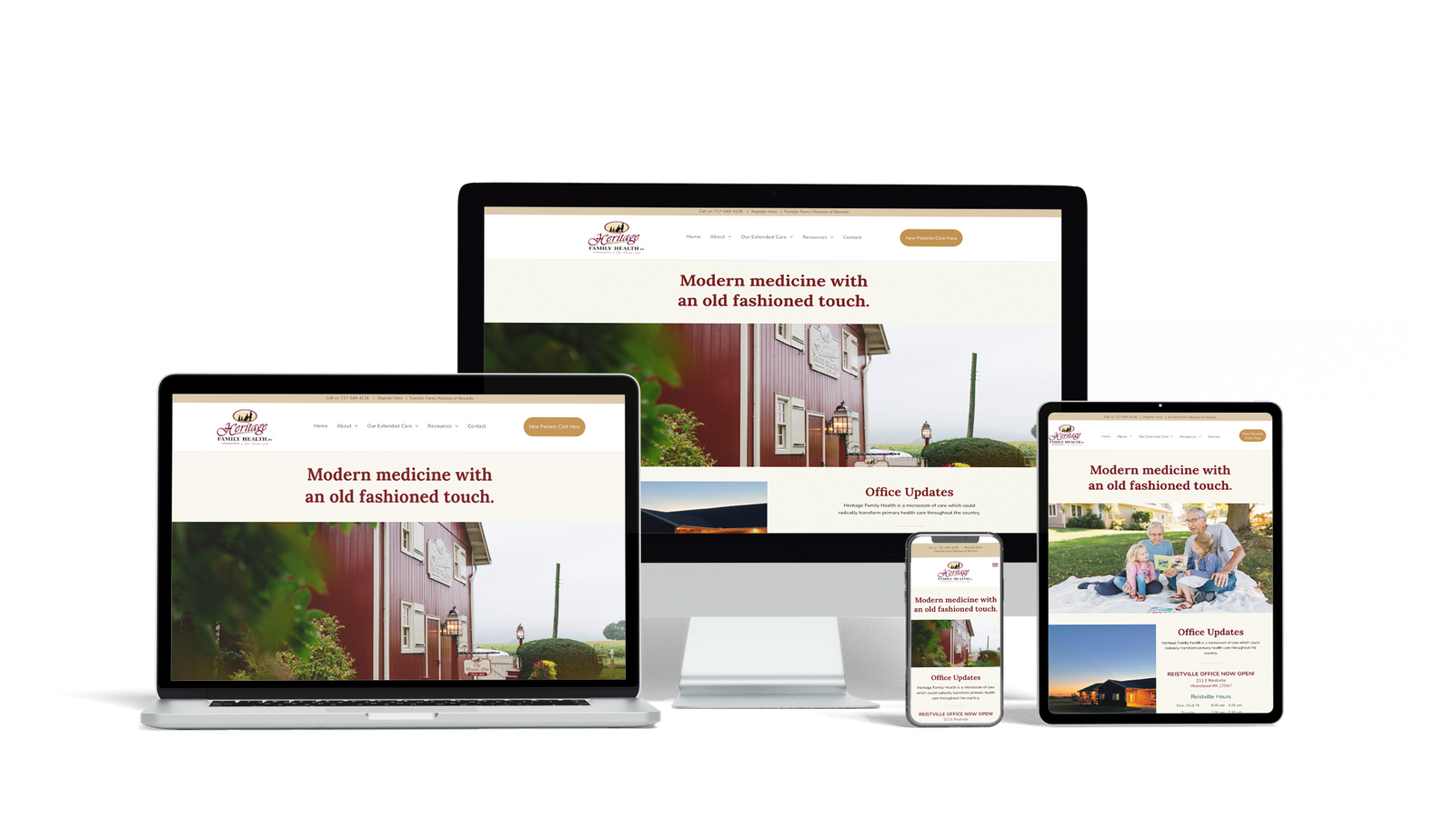
Let Us Build You the Business Website of Your Dreams
Are you tired of scrolling through endless web design templates, trying to build the perfect website? Look no further than Oostas. Our team of experienced designers is ready to help you bring your dreams to life. From sleek and modern designs to interactive user interfaces, we take the hard work out of creating a website that perfectly captures your brand's aesthetic. With Oostas, you'll have a stunning website that your clients will love to explore in no time. Let us handle the hard work so you can focus on what you do best.


